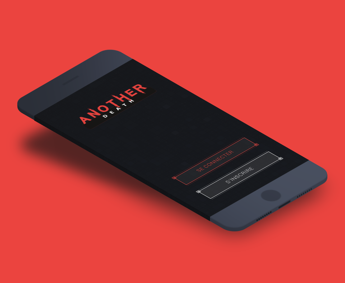
Another Death
A zombie game geolocalized on mobile phone
Introduction
For our graduation project at Sup'Internet, we had to realize an innovative web project with a team composed of students from the 3 different bachelors of the school (design, development and marketing). We chose to create a mobile video game on the theme of zombies. We wanted a game with a clear and simple principle. The player played a human or a zombie. Our game took place in a monthly season during which both factions (zombies and humans) had to reach their goal. As a human, the user had to survive to collect a certain amount of resources and as a zombie, the user had to prevent the humans from reaching their goal by infecting them to make them zombies too.
In a group of 12 people, I was responsible for the visual identity, the website, the UX of the application and the realization of different pages of the application.
[NB: All development and work on this game was done BEFORE Pokemon Go was released]
Goals
Design a game
It was the first time we were designing a game, so we had to understand all the peculiarities inherent to this medium.
Understanding the market
It was really important to analyze and understand the current market in order to offer a real, unique and innovative game that could find its audience.
Research
01. Geolocalized applications market research
Before starting the design of the game and the development of the application, we studied the location-based application market to first of all know if our game had a place in this market but also to better understand which audience could be that of a location-based mobile game.
From this research, we came to three conclusions.
We wanted to make our game around geolocation and augmented reality. But at that time, these aspects were already complex in themselves for many people. So we didn't want to lose our users with barbaric and technical terms. We had to offer the user elements that they could easily understand and relate to. In our case, it was about a simple and readable interface and easy to access gameplay.
Mobile games are subject to constraints and we had to take them into account during the design and development of the game. We found three main constraints:
Game time - Users mainly play on multiple short sessions because it is a nomadic activity and also because of the autonomy of the phone.
Player's concentration - It depends directly on the player's environment and playing time.
Connectivity - Access to a 3G network is crucial for online smartphone gaming, even more so in the case of location-based gaming.
A game on a mobile phone should not be treated like a game on a traditional game console. It is a special medium that has its own possibilities. Traditional gamers like to play in their living room for two hours at a time, urban games cannot replace this because they are not as immersive. But they have their own potential.
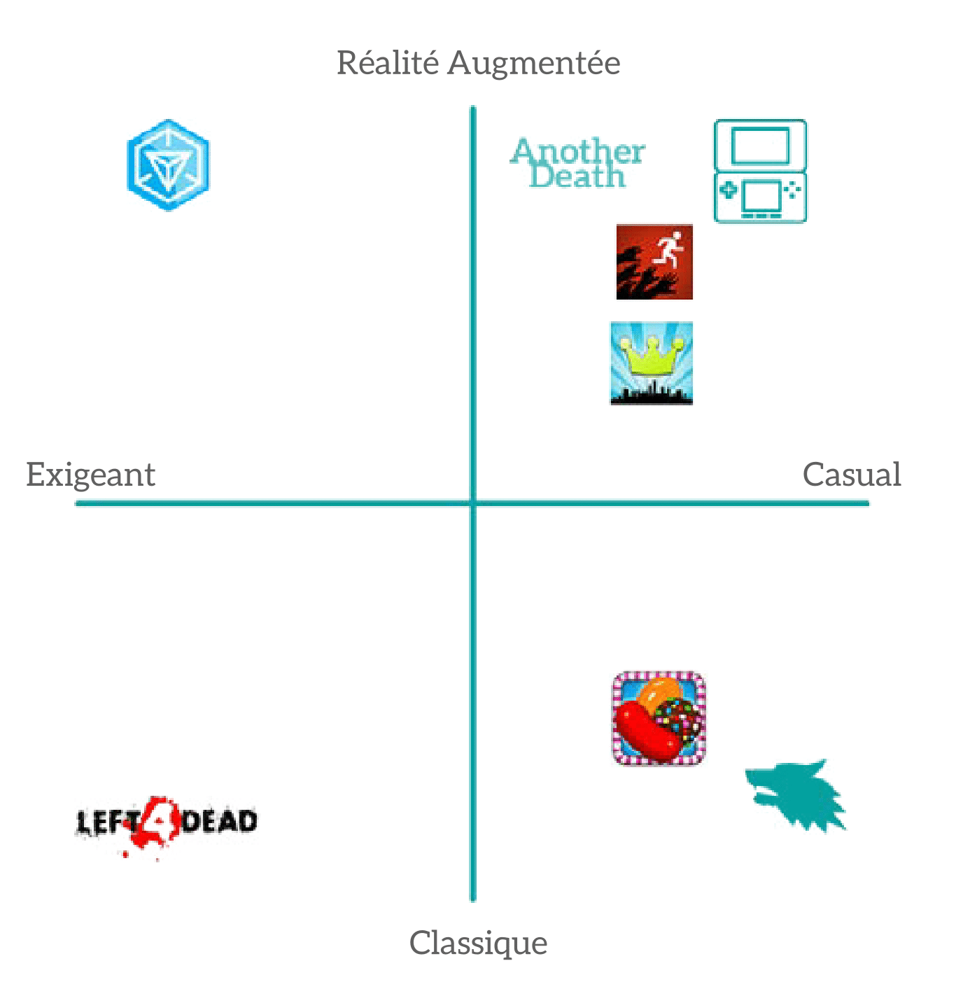
02. Mapping
Next, we analyzed and placed our biggest competitors in the field of location-based mobile gaming in a mapping.
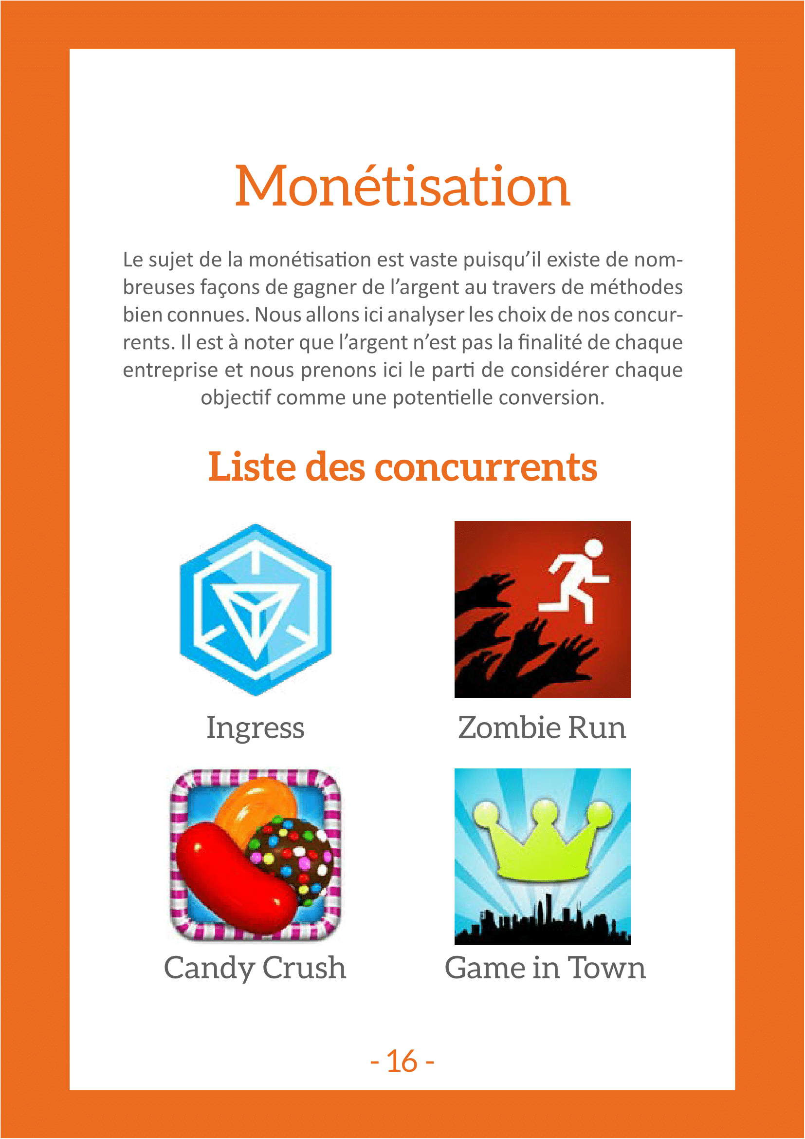
03. Benchmark
Then we benchmarked our main competitors by focusing on 3 specific points: game design, features and monetization.
04. Lessons
Our main target was between 15 and 26 years old, lived in big cities and played a lot on their phones, without necessarily trusting geolocation. Even though our users were playing in big cities with excellent connectivity, they were also playing in the subway where connectivity could be really bad. This paradox could become our strength if we could turn the subway into a game mechanic that would really set us apart from our competitors, even if it was just a passive mechanic.
Our best competitors and models have managed to drive innovation to finance themselves with brands. Advertising and "pay to win" are denigrated. Our main conversion step being on stores, we couldn't afford to have bad reviews on a regular basis. We therefore had to develop a system that was interesting for both the brands and the player to finance our project.
Geolocation and augmented reality were real innovations at the time. Combining innovations with a heavy game would have been too indigestible for our users. But offering them too light content would also have been a mistake. So we had to offer them content that spoke to them and appealed to them, but with a very effective underlying mechanic. Being able to offer such a large amount of dual-reading content was one of the keys to our success.
Game Design
After this first stage of research and thanks to its teachings, our group was able to think about the universe we wanted for our game and define its mechanics. We therefore thought about the conditions of victory, the controls that our users could have and also about a way to monetize our game without making it a "pay to win" game.Once all these elements were defined, I was able to start working on the UX.
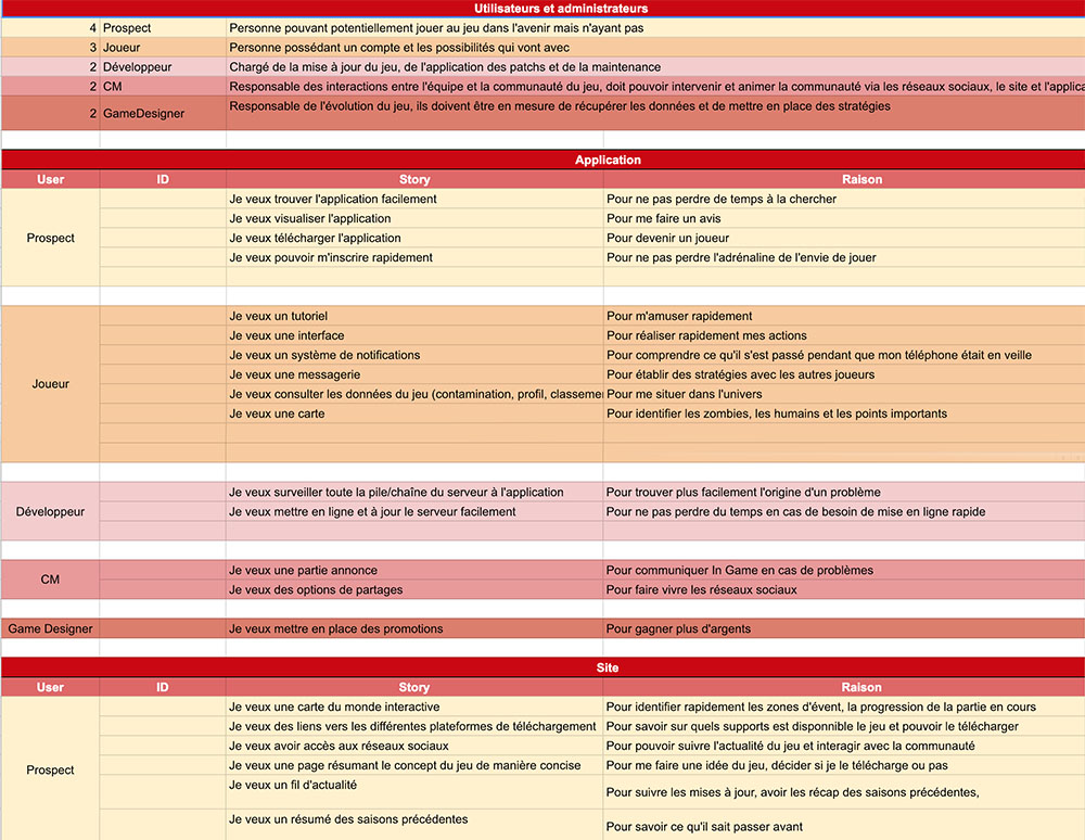
Story case and user flow
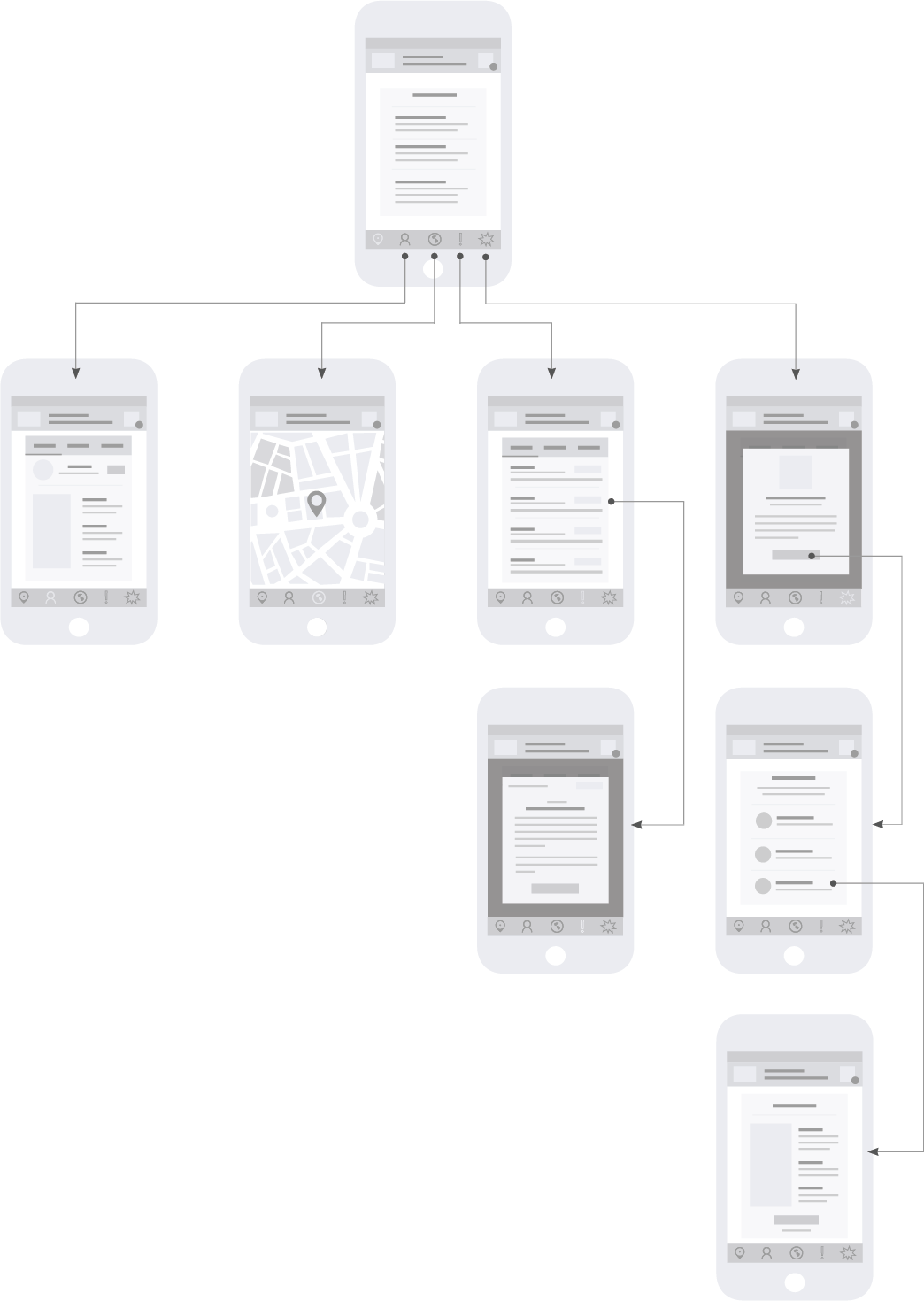
As our gamedesign began to become more precise, we were able to create a few user stories to better understand our users and build a better experience. After that, I set up an organized hierarchy and worked on the steps our users would follow, as this was critical to designing our final solution.
Visuals
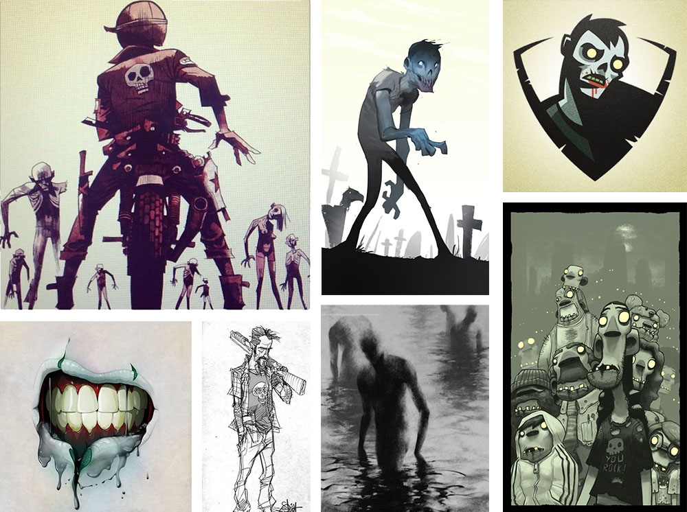
01. Moodboard
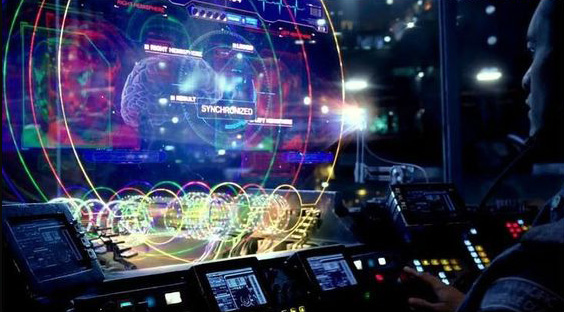
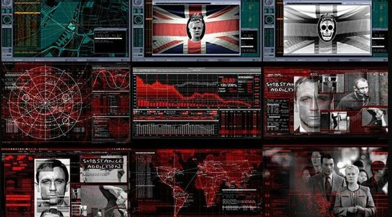
For the visual identity of our game, we took two different paths of inspiration. A first one for the illustration of the game. We looked for inspiration around zombies, the post-apocalyptic world, all in an atmosphere between cartoon and realism. Our second inspiration was mainly about the user interface of our website and our application. We found some ideas in the futuristic interface that we could see in science-fiction movies in particular.
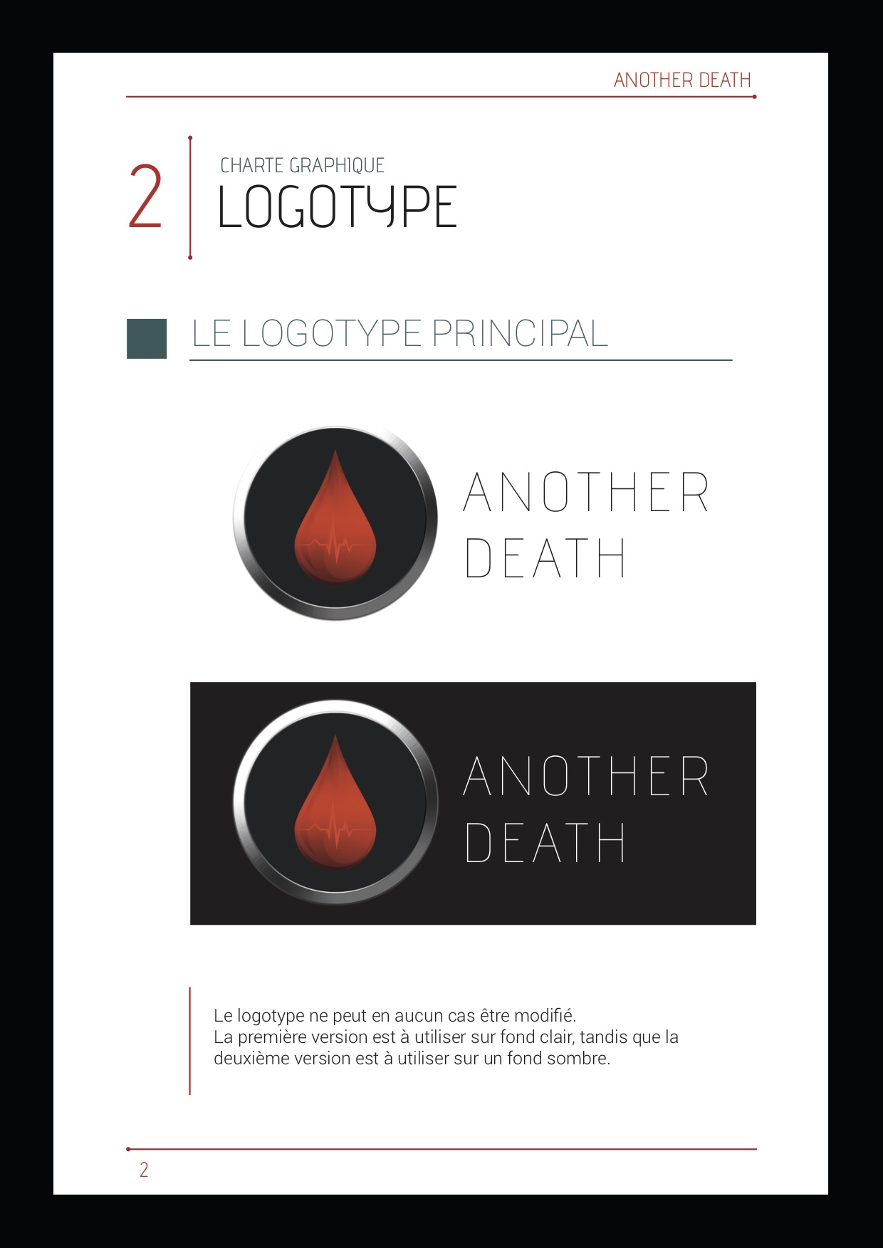
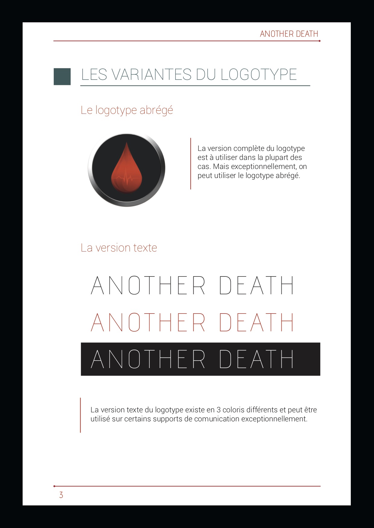
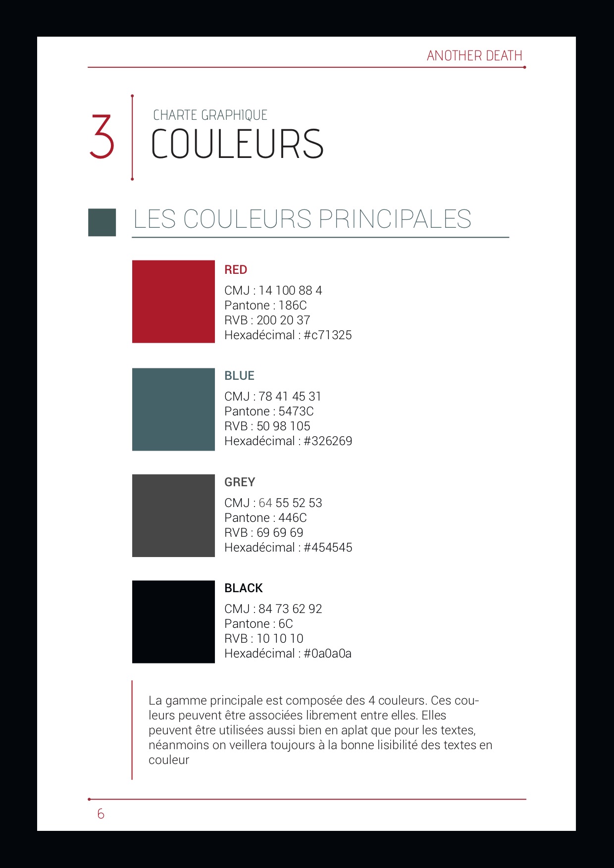
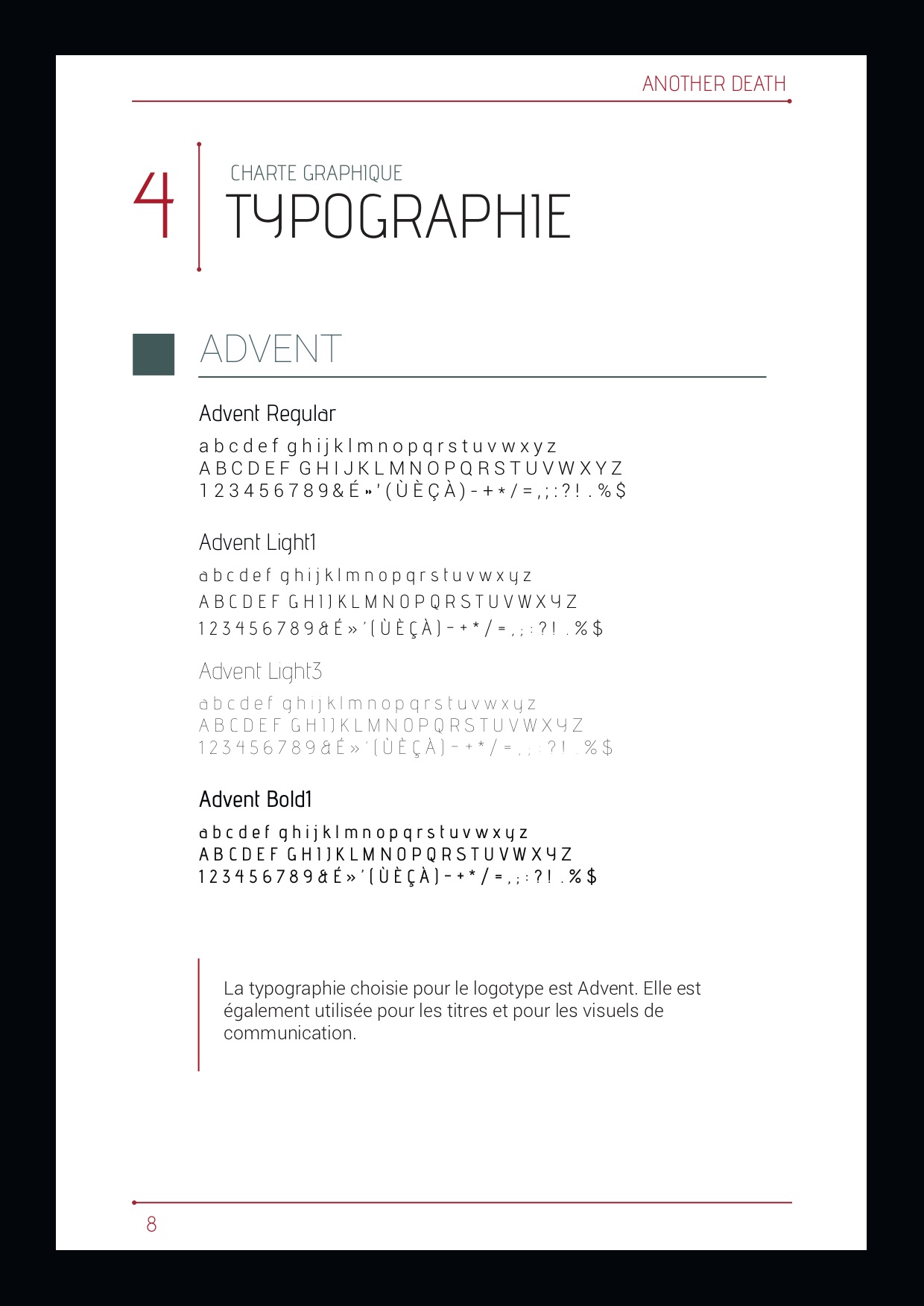
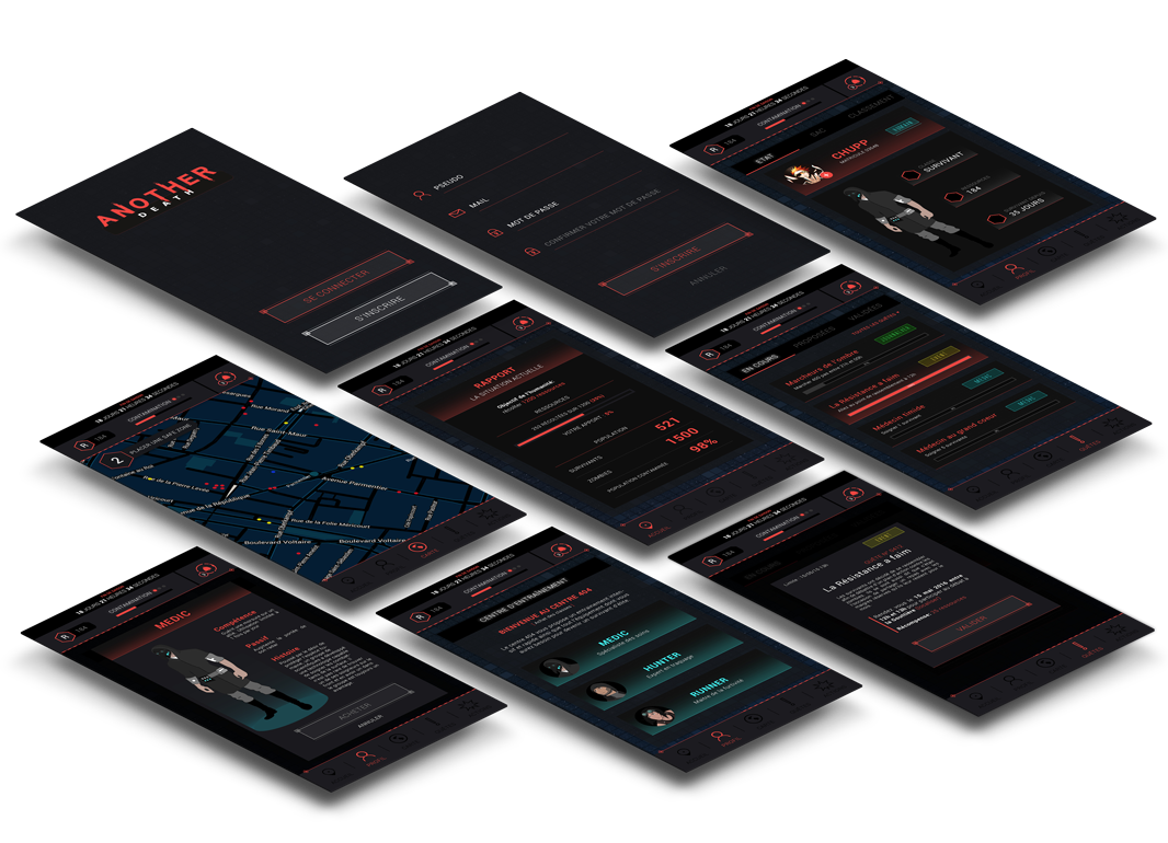
02. Visual identity
We used this style guide, not only for our application but also for our documents, social media, websites etc...
Base
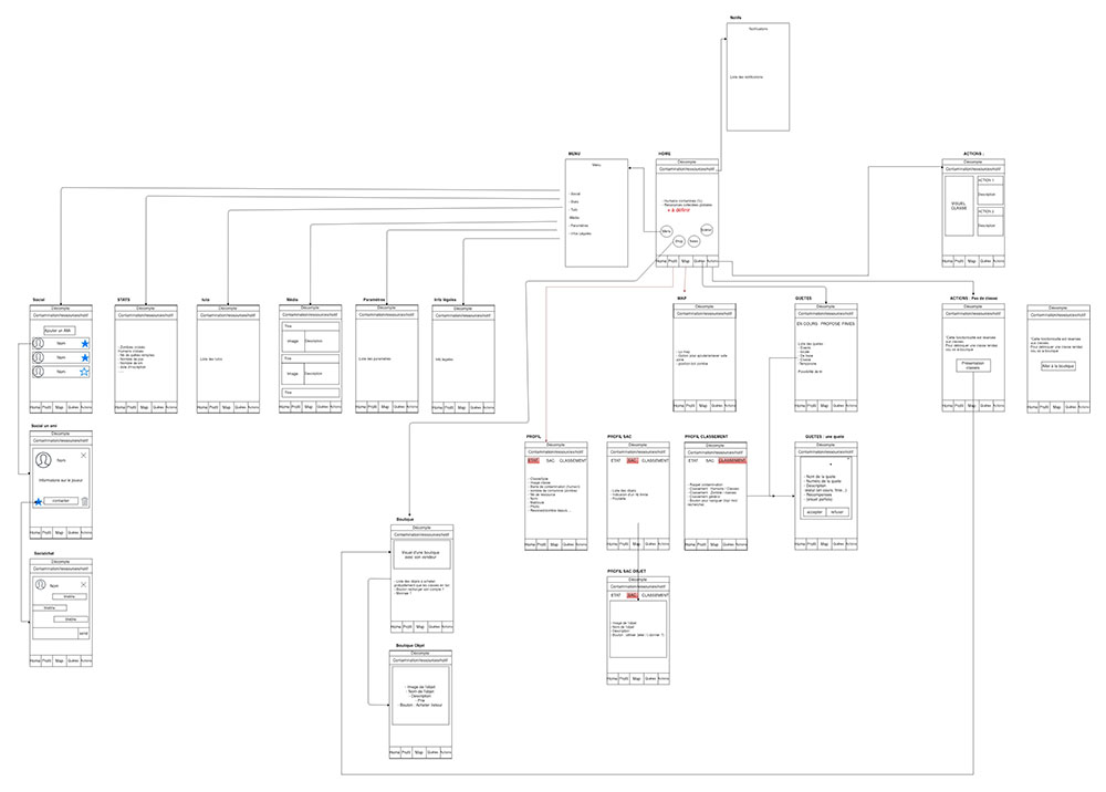
With wireframes, I was able to organize and structure our content to create an interface that met the needs of the players.
Solutions
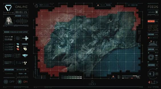
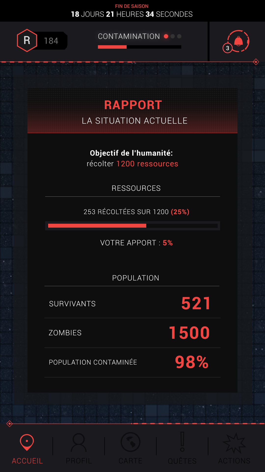
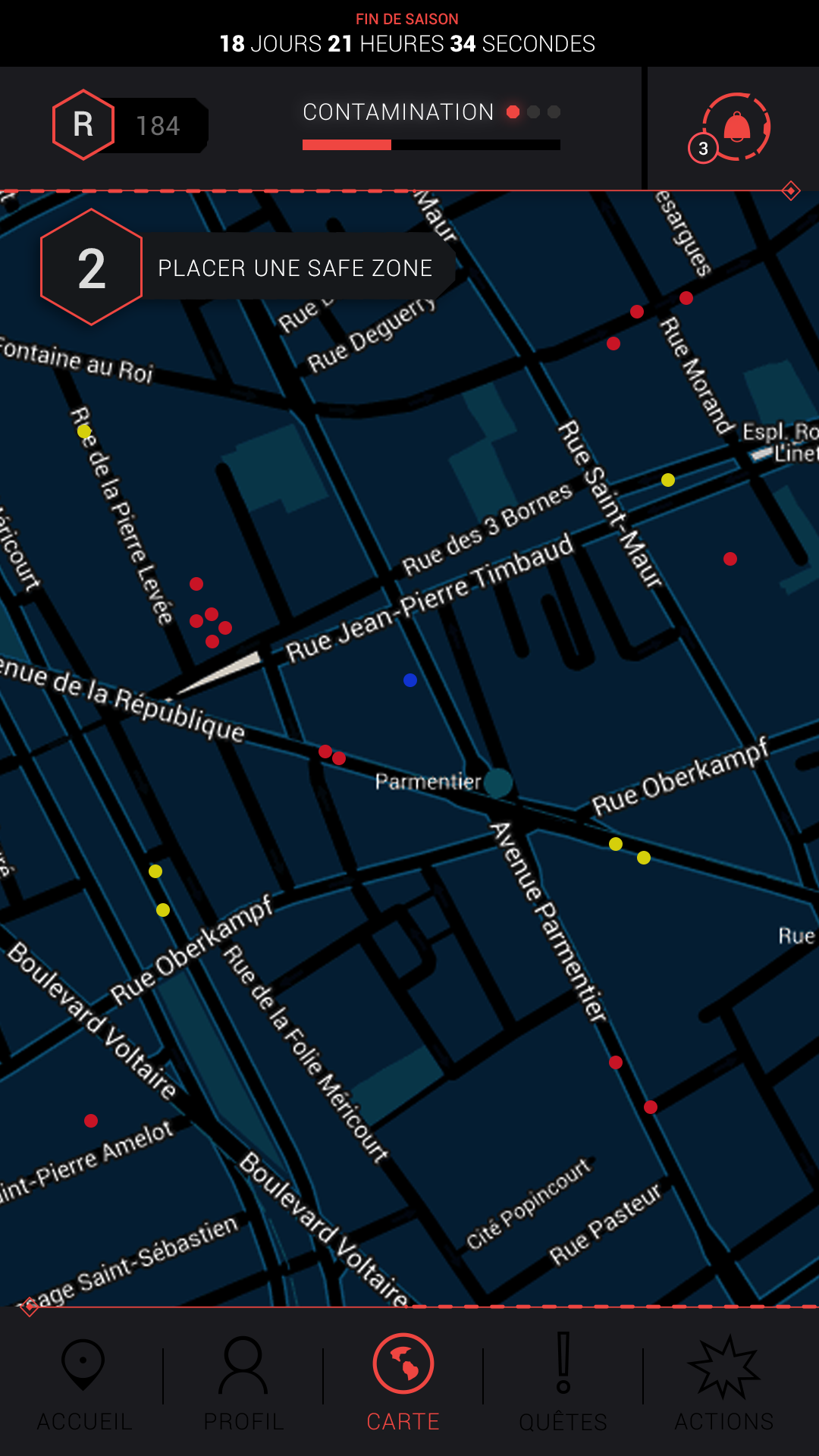
For the application, all important information (contamination rate, collected resources, map...) had to be easily accessible. So I centered the navigation around 5 main elements: the home page, the profile, the map, the quests and the class actions.
Everything at a glance
The homepage was really important. It contained all the important information about the current season.
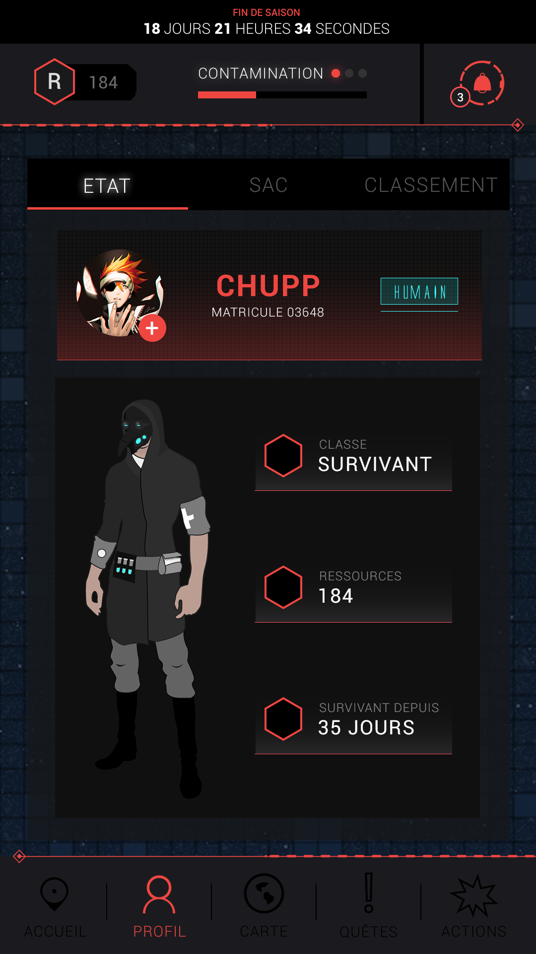
Profile page
From their profile page, the users could access their inventory but also their ranking where they could see their position in relation to others. It was a way to encourage them to become number one.
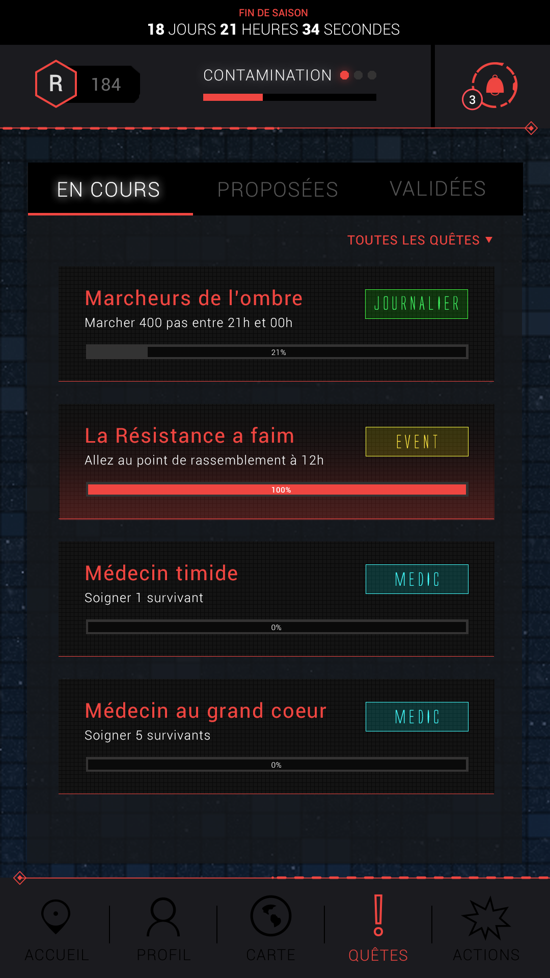
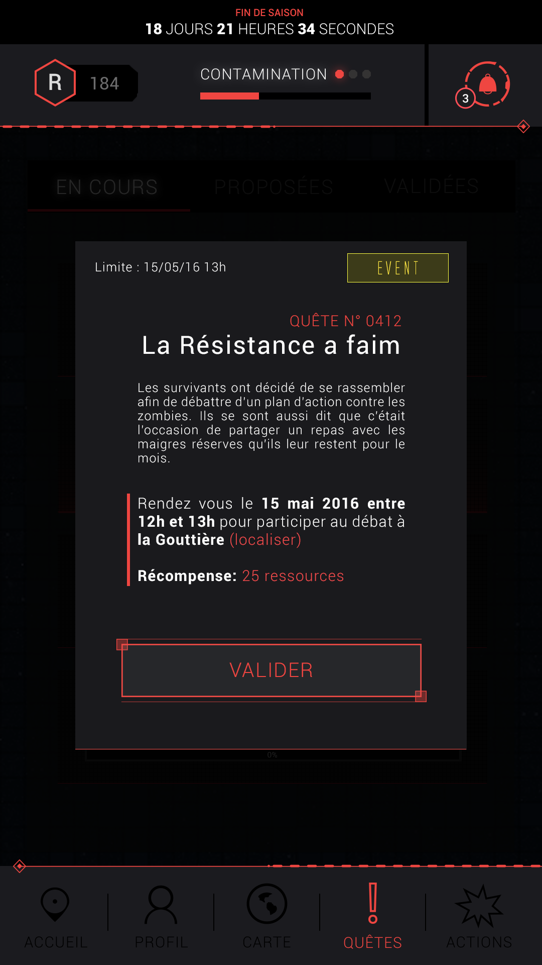
Quests
To gain more resources, which was one of the conditions for our game to win, we offered quests to players. Some of them were class-specific.
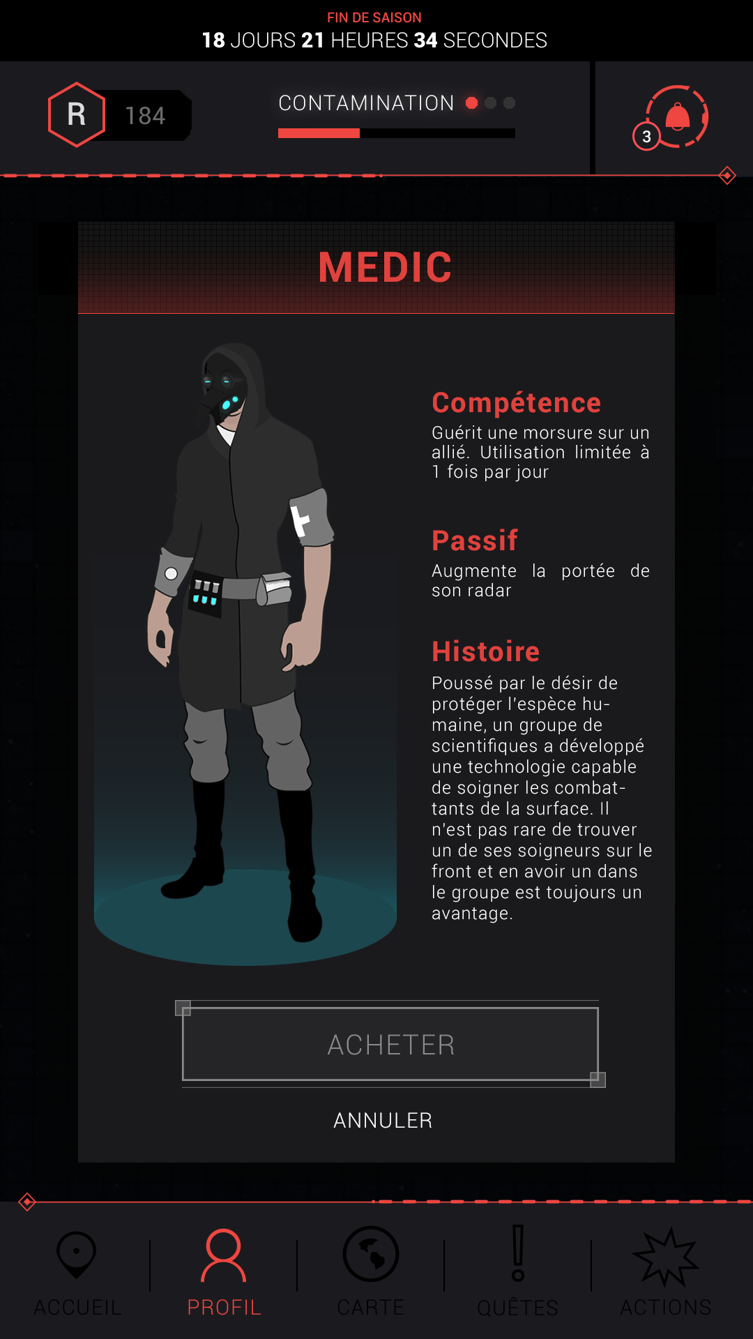
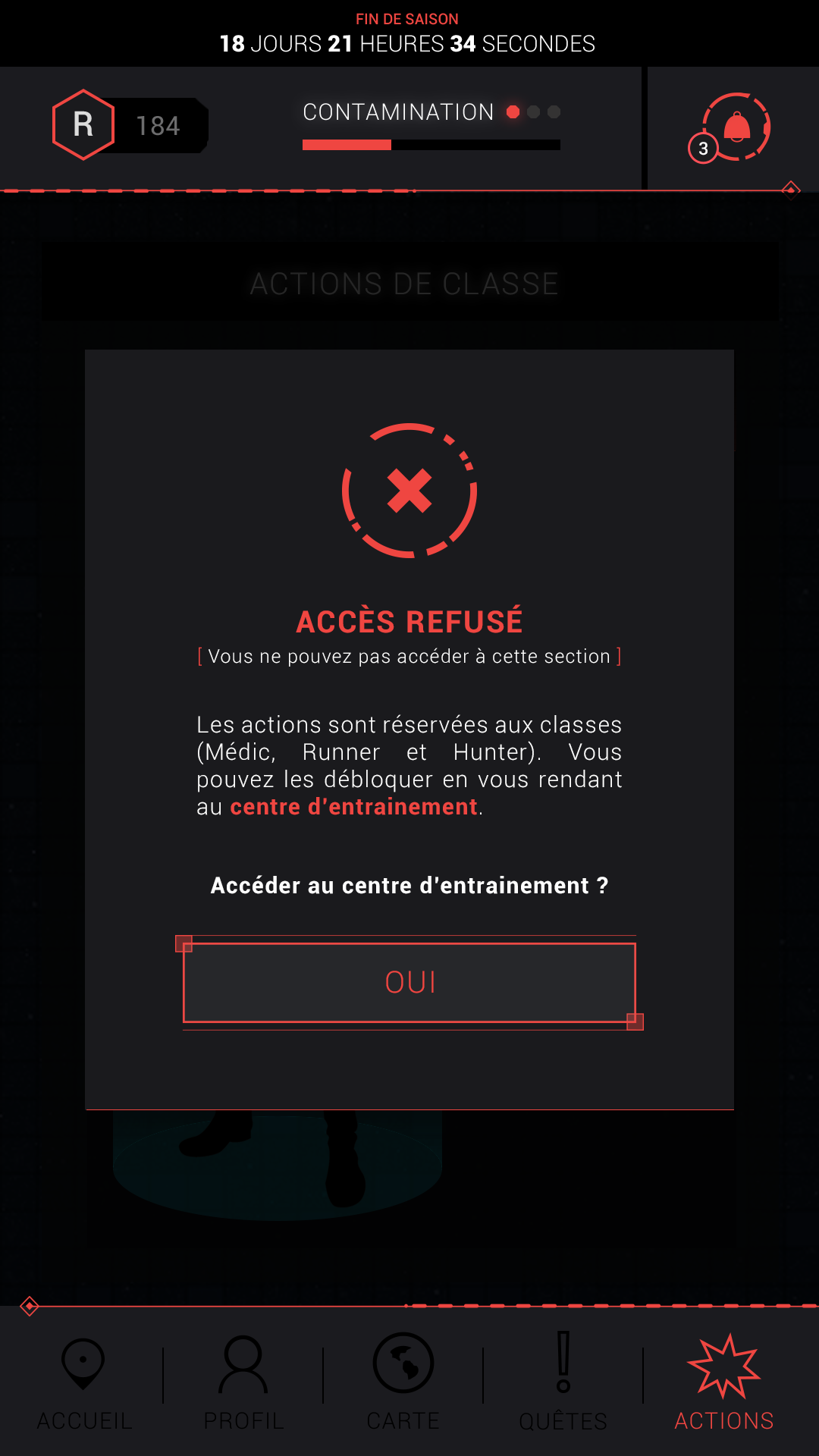
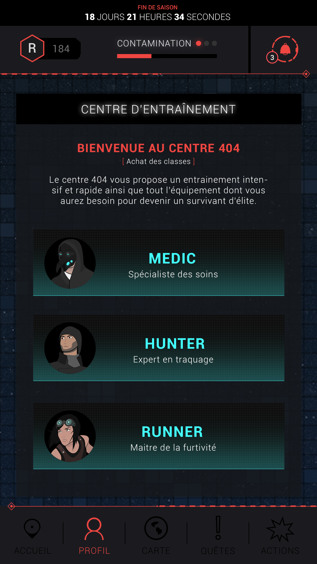
Class actions
It was possible for our players to unlock classes if they paid for them. These classes allowed to unlock new actions to change certain elements of the gameplay. This experience didn't make the game any easier because we didn't want a "pay-to-win" game, but these classes made the gameplay more interesting.
Constant pressure
Our game was based on month-long seasons. At the end of a season, one of the two factions was declared the winner, the best players were rewarded with our ranking and a new season could begin. These seasons were a key part of our game and everything flowed from there, so the countdown to the end of the current season had to be visible everywhere. Also, it put a bit of pressure on the player, which contributed to the apocalyptic atmosphere of our zombie game.
Conclusion
Another Death is a very important and dear project for me. First of all, it was the first time I had the opportunity to work on a game and I learned a lot. Especially because it was a mobile game, I learned a lot about the constraints of this kind of game. In addition, this school project was done with a large group of people and I was in charge of the design team for over a year. It was the first time that I led a group of people for a long period of time and it was an interesting and enriching experience.
In the end, this project never officially came out and remained only a school project. However, when we made our last presentation for this project in our school, the video game Pokemon Go had just been released. And now that we've seen the success of this game, also based on geolocation and augmented reality, we tell ourselves that we were on the right track ;)
Thanks for reading ! ✌
If you want to discover more awesome projects, click here !
O'Gaming
Graphic Design
Watchmusic
UI/UX/Motion
Ubisoft Hackathon
UI/UX
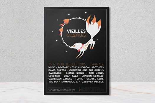
Les vieilles charrues
Brand Identity/UI